As always, we've been hard at work on extending and improving the features in GNU Radio. This is just a quick update on a few of the things we've been working on recently.
First, I have been adding specific pages to the Doxygen Manual that catalogue and describe certain features and functions of GNU Radio. You can find these in the "Related Pages" section. They feature discussions and examples for how to use some of the features in GNU Radio that might not otherwise be obvious. I like this model since it keeps the documentation of the code directly integrated into the code and the build system. You can always have a local copy of the manual for your version. We're also not trying, then, to keep multiple versions of code documentation all over the place.
Today, to make things easier, I expanded our Documentation section on the main GNU Radio webpage to directly link to some of these pages. I'm not sure how many others have found them or are using them already, but I wanted to make sure it was easy to what was available and where to locate the information.
The other thing that I wanted to mention today is the work that's been done on the QTGUI blocks. These are visualization tools for signals in GNU Radio. We've been significantly improving them over the past few months.
The first major improvement has been to add direct user control over the parameters while operating live. The figure below shows a screenshot of the gr-qtgui example *pyqt_freq_c.py*. First, notice the overall color scheme. This is based of the ability to use QT style sheets that can define the look of a QTGUI app. In this running example, I right-clicked outside of the curve canvas itself (where right-click means to unzoom) to pull up the menu. As you can see, the menu allows us to adjust a number of parameters. Some of these are available in all plotters, but others are specific to the type of plot (the FFT size or averaging would be meaningless in a time domain or constellation plot). In this figure, I have adjusted the color of line 'Data 0' to red, increased the width of the other two lines, changed the FFT size to 512, and turned on averaging. I then stopped the graph and tool a screen shot to make this image (notice, though, that there is a 'Save' option in the drop-down menu; this saves the current plot, but it would not have included the menu information).
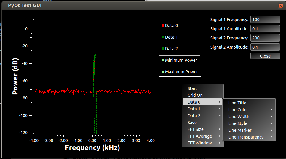
I would encourage anyone using the QTGUI plotters to play around in these menus to understand the kind of flexibility we now have while looking at signals.
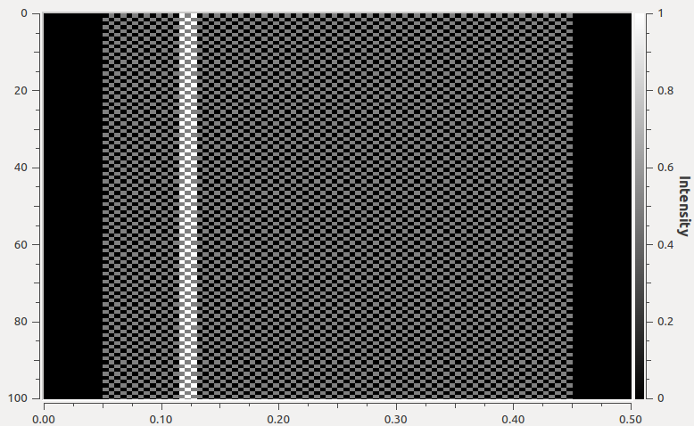
Finally, before this post gets too much longer, I wanted to also note that we have just added a new QTGUI plotter to do time raster plots. These types of plots show samples in time, line by line, so both x and y axes are in time. This is often used for looking at data and packet structure. The GNU Radio plotters can accept multiple signals in that are then plotted as an overlay. The intensity is then shown as the sum of the samples, so it will be higher when then overlap and lower when they are different.
The figure below shows the output of the example pyqt_time_raster_b.py that is shipped with GNU Radio. It has one signal that has 10 zeros, then 80 bits of alternating ones and zeros, and then ended with another 10 zeros. Another signal is then overlaid on top that just has a pattern of 3 one part-way into the vector. These vectors are then repeated. We can see the bright white stripe is where we get the 3 ones from signal 1 on top of the samples in signal 0.
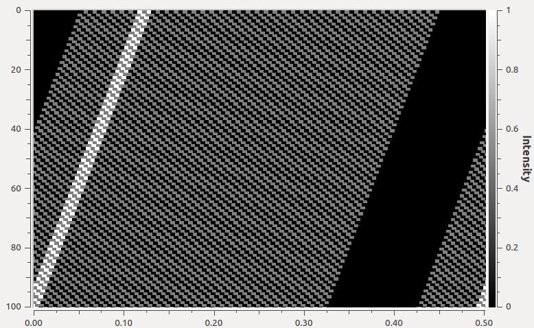
Also note the diagonal. We draw these figures on a grid of a number of rows and number of columns. If we had 100 columns in this example, the samples would be plotted in straight columns. But in many situations where these types of plots are useful, we may have some fractional offset we want to handle. This example is showing us that we can set the number of columns to 100.25, so there's a quarter bit overlap between rows that causes this diagonal. Using the drop-down menu, we can adjust the number of columns to 100 to get what we see below.