Blog

QT GUI Widgets with Message Passing

 Just today, I issued a Pull Request for a new feature in GNU Radio. This adds a new form of what we already called the QT GUI Entry widget. That widget provides a simple QLineEdit box where we type in values, they get stored as a Python variable, and we pass these variables around like normal GRC variables. When running, updates to the entry box are propagated to anything using that variable in the flowgraph.

We're trying to move beyond this world where everything is in a Python file that's assumed to be completely local. Instead, we want to move to a world where we can use the message passing architecture to manage data and settings. So when we have a message interface to a block, we might want to post data or update a value through that message interface from a UI somehow. This leads us to the possibility that the UI is a separate window, application, or even machine from the running flowgraph. We have already made strides in this direction by adding the postMessage interface to ControlPort, which I spoke about in the last post on New Way of Using ContorlPort. However, ControlPort can take some time to set up the application, craft the UI, and make a working product. Aside from that method, we wanted to have easy ways within GRC to build applications that allow us to pass and manage messages easily. Hence the new QTGUI Message Edit Box (qtgui_edit_box_msg).


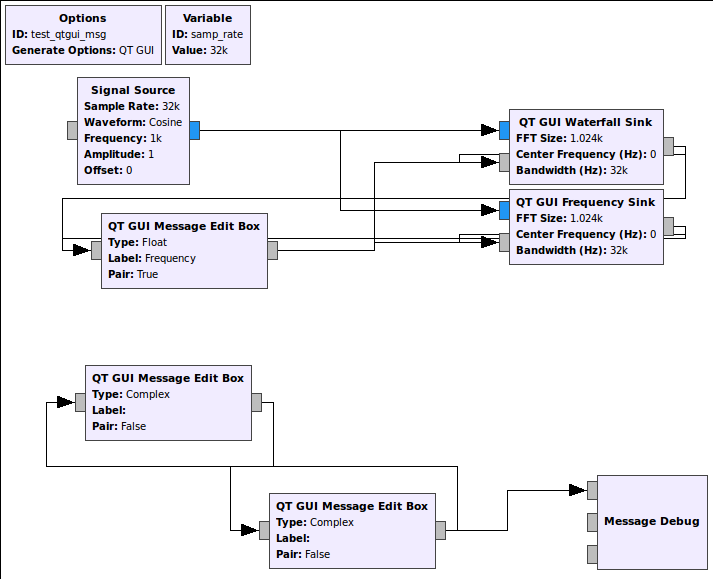
This is an flowgraph example that now comes with GNU Radio's gr-qtgui (test_qtgui_msg.grc). This shows the use of three of the new message edit boxes. In the upper part of the graph, we have the edit box controlling the center frequency of a Waterfall and Frequency Sink. These sinks can take in a message that's a PMT pair in the form ( "freq" <float frequency> ). So the edit box has a setting called Pair that sets this up to handle the PMT pair messages. It's actually the default since we'll be using the key:value pair concept a lot to manage message control interfaces. When the edit box is updated and we press enter, it publishes a message and the two GUI sinks are subscribed to them, so they get the message, parse it, and update their center frequency values accordingly.

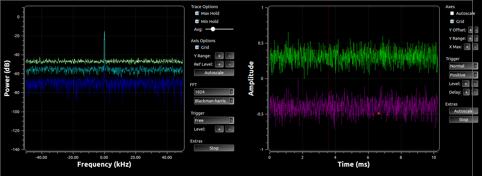
Now the flip side of this is that the edit boxes also have an input message port. This allows us to programmatically set the value inside the box. The two GUI sinks have the ability to have a user adjust their center frequency. When a user double-clicks on a frequency in the plot, the block sets that value as the center frequency and then publishes a message (in the same key:value pair where key="freq"). This means that not only is the widget we just double-clicked updated, anything listening for that message is updated. So the edit box is kept in sync with the change in the GUI. Now, when the new data received is different than what was in that edit box to begin with, the box re-emits that message. So now, say we double-clicked on the Frequency Sink near the 10 kHz frequency line. That message is propagated not only to the edit box, but the message also gets sent from that box through to the waterfall sink. Now all of the widgets are kept in sync. And because the re-posting of the message only happens when a change occurs, we prevent continuous loops. Here's the output after the double-clicking:

Both GUI display widgets have the same center frequency, and that value is also shown in the Frequency edit box above. Because it's using the pair concept, we have two boxes, the left for the key and right for the value.

This example has two other edit boxes that show up at the bottom of the GUI. This is to allow us to easily test other properties and data types. They are connected in a loop, so when one is changed, the other immediately follows. Note here that we are not using the pair concept but that the data type is complex. To make it easy on us, we use a Boost lexical_cast, which means we use the format "(a,b)" for the real and imaginary parts. All of this, by the way, is explained in the blocks'd documentation.

Now, we have the ability to pass messages over ZMQ interfaces. Which means we can create flowgraphs on one side of the ZMQ link that just handle GUI stuff. On the other side, we use ZMQ sources to pass messages around the remotely running flowgraph. Pretty cool and now very easy to do in GRC.

This is just one way of handling QT widgets as message passing blocks. Pretty easy and universal for sending messages with data we're used to. But it's just a start and a good template for other future widgets to have similar capabilities, like with range/sliders, check boxes, combo boxes, etc. All of these should be able to pretty easily use this as a template with different GUI widgets for manipulating the actual data.

QTGUI Tools and Tips

It's been made apparent to me that not everyone knows about all of the capabilities in the QTGUI plotting tools we have in GNU Radio. We've also recently added a number of features that I think people will find really useful and wanted to expose here. I'll focus on just the time and frequency plots, but you'll also find a constellation plot (real and imaginary), a waterfall plot, a histogram, a raster, a generic vector plot, and a number sink.

Drop-down Menus

Each QT sink has a set of control that are specific to controlling each graph, though they share many common attributes. To access the drop-down menu, use the middle mouse button, which in cases of two-button mice might be a ctrl+click or clicking both mouse buttons together. The mouse wheel often acts as the middle mouse button. There's been some call for changing this to the right mouse button, which I'm sympathetic to, but I think we'll want to review all mice interactions to see what makes sense for everything. But for now and through v3.7.7 at least, it's the middle mouse button.

This shows the menu options for the time plot (if you can read it; my resolution is pretty high on my screen). You can set the line properties such as colors, width, markers, and style. Set the number of points to plot, change to log scale for either or both axes, turn it to a stem plot, or set the trigger options.

Some of the common properties to the graphs is the ability to start and stop the plotting, autoscale the y-axis, and save the image to file. The time, frequency, and constellation plots also have the ability to trigger off of the incoming signal. You can set the trigger to free (no triggering), auto (trigger off an event but update the plot after a time anyways), or normal (only update when the trigger hits). For the constellation and time plots, there is even the option to trigger off a specific stream tag. You can then set the level of the trigger event, the channel to trigger off of, and a few other standard triggering attributes. For the time and frequency plot, we now (as of v3.7.7) display a dashed red line to show where the triggering will occur.

There are plenty of options here to look into and play around with once you know that drop-down menu exists.

QSS Files

If you've used the QT GUI plotters before, the above graph might look a bit odd to you. You're probably used to seeing it as a white background with blue and red lines drawn on it. Well, the plotters can actually have most of their attributes controlled by a QT Style Sheet (QSS file). You install them by simply editing your GNU Radio config file. Either edit or create a new $HOME/.gnuradio/config.conf file and add the following:

[QTGUI]
qss = $prefix/share/gnuradio/themes/alt.qss

Where $prefix is the installation prefix you installed GNU Radio into (often /usr or /usr/local). Below is a look at the normal, non-qss frequency plot versus the alt.qss plot that's installed with GNU Radio.

QTGUI Frequency Plot without a QSS file used.

QTGUI Frequency Plot without a QSS file used.

QTGUI Frequency plot with alt.qss file used.

QTGUI Frequency plot with alt.qss file used.


Control Panel

We just recently added control panels to the time and frequency sinks. We will be continuing to roll out this concept to the other plots as well, but these were the first two to get the attention. The control panel is a set of widgets on the right-hand side of the graph to provide very quick and easy access to manipulating the look of many of the plot properties. You can see in the image below that we can adjust things like the x and y axis limits, do an autoscale, toggle things like min/max hold or the grid, and adjust the triggers. For the time plots, the autoscal check box turns on continuous autoscaling of the plot based on the latest set of samples while the button just does a one-shot autoscale and then holds the y-axis from there.

We can also toggle this on and off. One of the reasons I did not have this in the first place was that it takes up a lot of plotting real estate on the screen. However, when manipulating the plots, it is definitely much easier to use these tools than the drop-down menu for many of the purposes -- setting the trigger is a good example. Still, we can actually enable and disable the control panels as we need them. We can do this in GRC by going into the properties box for the plotters and setting the Control Panel option in the Config tab to Yes or No. At runtime, the drop-down menu has the option of enabling or disabling the control panel as well, so you can use it and hide as you need.

Legend

Another brand new feature is the ability to turn the plotter legends off. Tim O'Shea requested this feature, and it really seemed like a good idea. The lines in a plot are labeled, and those labels show up in a legend on the right-hand side. When plotting a lot of lines together, this can be really useful to distinguish them and present the results to others. See my recent post on the new LDPC and TPC codes and the BER plot. There, we use the legend to show which line is for which FEC technique. However, often we just plot a single line, in which case the legend just takes up an unfortunate amount of space. So now, in the GRC properties box under the Config tab for each QTGUI plotter, we can toggle the legend on or off. This cannot be done at runtime, however. Below is an image of two QTGUI time plotters showing the same signals. The one on the right has the legend on and the other has it off. This shows how much less of the display is wasted by a legend that, in this instance, doesn't tell us much about what's being plotted.

The only plotter that works differently than the rest The waterfall plot just removes the intensity legend on the right-hand side. You won't be able to relate the colors to specific power levels, but often we just need to get a glimpse of the signals and have an understanding of the relative power levels, not the exact numbers.